I was the Account Executive at The Agency for The Prison Project. Part of my responsibility for this role was meeting with our clients bi-weekly to come up with goals and plans to help ensure The Agency was meeting these standards. My partner and I collaborated with The Prison Project and came up with a plan to bring awareness to the project itself.
THE GOAL:
The overall goal we came up with was to raise awareness for The Prison Project. To do this, we had to narrow down the client's audience from the "general public" to Quinnipiac's student body. This decision allowed us to create a brand identity that resonates with students, as well as create deliverables to raise that awareness.
OUR APPROACH:
We started by rebranding its identity altogether, which I got to work directly on as part of The Agency's graphic design team. After lots of trial and error, we finally came up with a logo we all loved. After this, I created a simple branding kit for the Prison Project. Once the branding kit was made and provided to them, they now had a recognizable identity that they can use. We were then able to make their flyers and other deliverables that they were able to use to educate the student body on what exactly their purpose was. On top of this, we met with the copy team to rewrite their vision statement and help their audience understand their purpose.
COMPOSITIONS:
Below are the final stages of the logo. The client emphasized they wanted their color scheme to match Quinnipiac's, and they wanted it to stand out using all three colors.
FINAL LOGO:
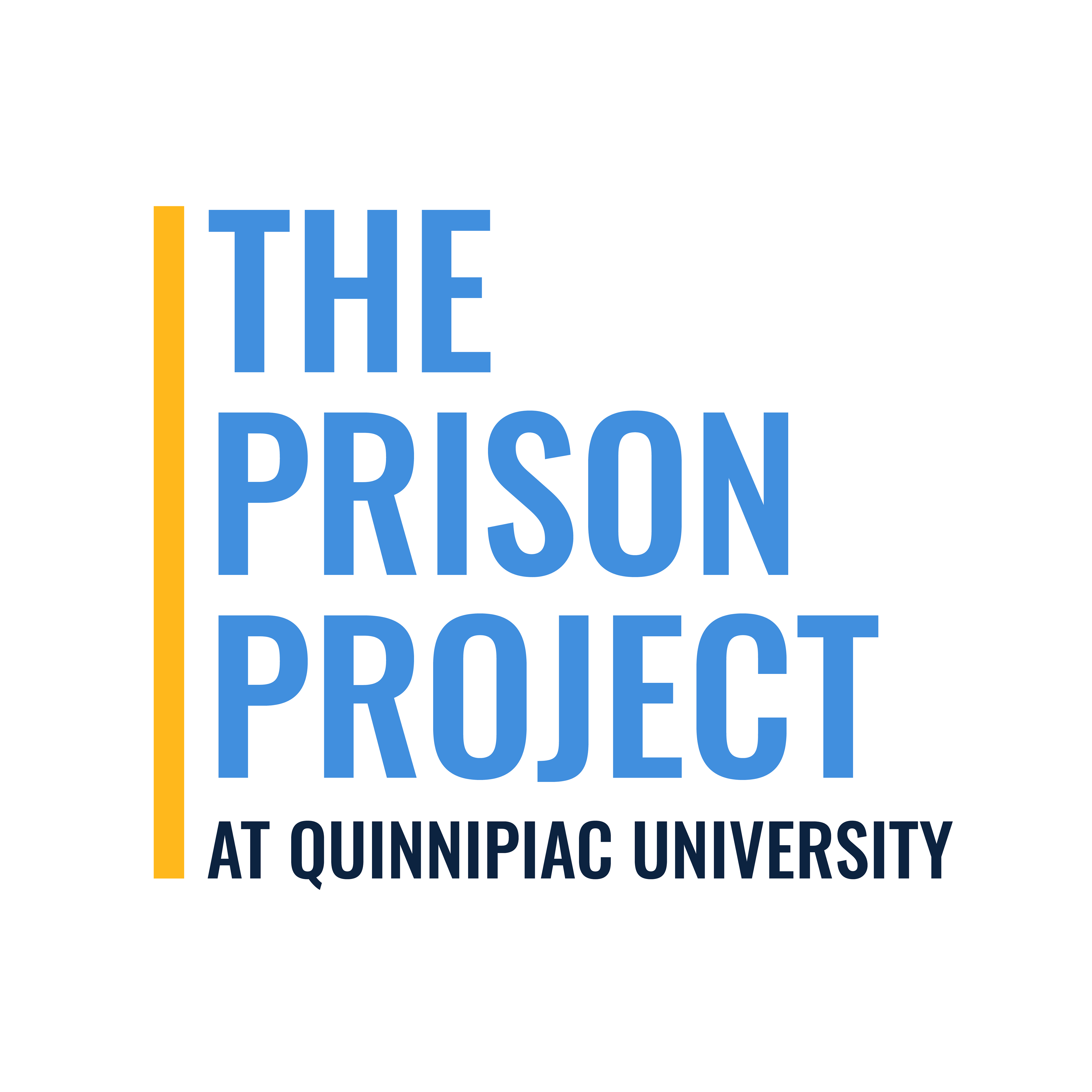
The graphic design team and I agreed that the logo which had each word a different color did not align with the Prison Project's values. The Prison Project is bringing communities together, we believed this logo variation created a divide. We explained to the client our thought process and then provided them with an alternative logo which they loved and is now the final logo.
The final logo incorporates all three colors the client wanted to use. The gold bar used on the left of the design is a bridge between every layer of the composition. It represents hope and unity, and is a flexible piece of the logo as it can be extended to bleed off the page, or shortened to simply sit next to the type.
THE BEFORE AND AFTER:
Here is what The Prison Project's logo and website looked like prior to coming to The Agency.
The new branding we created for The Prison Project provides a hopeful feeling for their audience. The bright colors invite people in and give them an inspiring feeling. This logo is an amazing fit for The Prison Project as it leaves a sense of hope and unification, influencing people to create and inspire change.

